
Our Thoughts Behind the “Moon Phase”—The Story Behind the Creation of the Mechanical Moon Phase
October 2, 2023

The Mechanical Moon Phase became the “face” of Orient Star within a few years after its first model was released in 2017. How did Orient Star’s first mechanical moon phase watch come about? Katsunori Kume, the designer who played a central role in the development, and Masashi Takano, who was in charge of movement design, look back on the behind-the-scenes of its development.
Text:with ORIENT STAR editorial team
As the face of the brand, accuracy and aesthetics could not be compromised
―― How did the development of the Mechanical Moon Phase start?
Katsunori Kume (hereinafter “Kume”): Around the mid-2010s, there was an initiative in the company to clarify the brand concept of Orient Star and create a “face” of the brand. After much deliberation, we decided on the brand concept: “three joys of owning an Orient Star timepiece: joy of wearing the watch, joy of showing its charm and joy of connecting with others.’” And as a result of discussing on the model that would be the face of the brand, we agreed on making moon phase the theme.
―― Why was moon phase chosen?
Kume: One reason is that it follows the brand concept mentioned earlier. And the other reason is that we wanted people to fully enjoy the calm flow of time by wearing this timepiece, and feel relaxed when they glance at it. Mechanical watches are one of the few tools that allow you to enjoy analogue touches. Furthermore, we came across the idea that adding moon phase to this will allow people to feel a slow flow of time amid the hustles and bustles of the digital society.

―― Right, just like how we used to read the seasons from the phases of the moon, ages ago. It is rarely used today for its original purpose, but that is why there is also romanticism that makes us imagine the ancient times. Had Orient Star produced moon phase timepieces before?
Masashi Takano (hereinafter “Takano”): We had released quartz models, but this was the first mechanical model.
―― How did you proceed with developing the mechanical movement?
Takano: Prior to the development of the moon phase model, a caliber called the 46-F6 was the core movement. From there, we started aiming to create an Orient Star flagship and set two major goals. One was to improve accuracy so it would exceed the F6. The second goal was to refine the appearance and beauty of the movement. And both were achieved by the new caliber 46-F7.
―― I imagine it is difficult to increase accuracy.
Takano: It was. Actually, the movement design itself has not changed significantly from the F6. The machining technology of the parts and the watchmakers’ adjustment techniques greatly contributed to increasing accuracy in this development. For the parts, we asked the manufacturing department for strict dimensional accuracy and minimal variation by leveraging Seiko Epson’s precision machining technology. For adjustments, we went through production utilising the expertise we had gained from past Orient Star models, which also possessed high accuracy.

―― In what ways has the outer appearance been improved?
Takano: With the exception of divers’ models, Orient Star watches have see-through case backs that allow you to see the movement. The caliber F7 series has been redesigned to enhance the pattern of the rotor. Other parts, such as bridges, are chamfered so they sparkle when they catch light.
―― It is natural for a watch manufacturer to aim for higher precision, but why do you pursue the aesthetics of the movement? Is there a reason why it needs to be made beautiful?
Takano: It goes back to the brand concept elements of the joy of wearing the watch, and the joy of showing its charm. In other words, the joy of wearing a well-made timepiece of high quality and the pleasure of seeing it for yourself or showing it to others. Our concept is to provide such values, and this is why we worked towards enhancing the beautiful exterior as well.

―― It is certainly decorated with details that will boost your mood when you wear it. Were there any difficulties you faced when incorporating the moon phase indicator into the movement?
Takano: We have a rule that all Orient Star models must have a power reserve indicator. That is why there is an indicator placed at the 12 o’clock position. Furthermore, this model is a semi skeleton, so there is a hole in the dial at the 9 o’clock position so that you can see the balance wheel. That means the moon phase and date displays need to be placed when the spaces at the 12 and 9 o’clock are already used up. To display the moon phase and date, you have to put in the gears that set them out, and you also have to put in functions to adjust them. Moreover, the gears and functions must not show through the hole at the 9 o’clock position… With all these constraints, it was very challenging to incorporate the two displays.
―― So that’s why you decided to incorporate them coaxially at the 6 o’clock position.
Takano: Technically, we could have placed the date at the 3 o’clock position, but then the designer would have had a hard time placing the brand logo.
Kume: Thank you for the consideration (laughs).
Takano: However, the coaxial placement of the moon and date at the 6 o’clock position makes the movement a bit thicker. What happens then is that the balance wheel, which is normally visible just below the hole at 9 o’clock position, is moved slightly further back. The balance wheel becomes harder to see as it would be further away from the hole on the dial, but that was covered by the design.
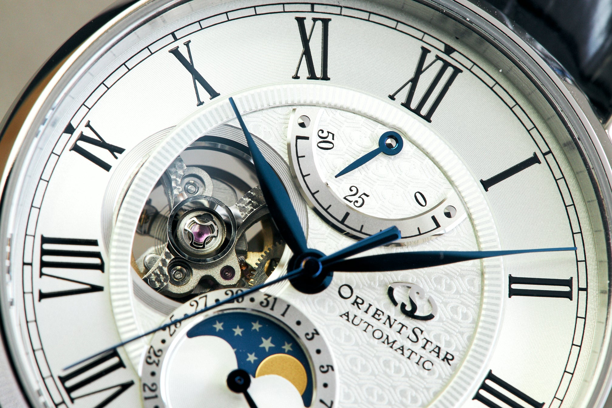
Kume: We added a new part that we call a “decorative plate” to that section. The hollow space between the hole on the dial and the balance wheel was a disadvantage, but we made it into an advantage by adding exquisitely decorated parts designed for the aesthetic. Normally, all parts of a movement have some kind of functional role. It was a new attempt to create parts used only for decoration, which is something we had never been able to work on.
Adding originality while paying respect to Western culture
―― From here, let’s change the topic to design. Where did you start working from in terms of design?
Kume: After clarifying the brand concept as I mentioned in the beginning, an in-house competition was held. About ten design plans came up, ranging from classic to modern and even sporty designs. From there, we narrowed it down to about five design plans, which we then made samples of, conducting user interviews and asking our management for their thoughts.
―― The Mechanical Moon Phase is a timepiece with classic touches. Why was this classic taste chosen among the various design plans?
Kume: As the watch would be the face of the brand, we had a strong desire to offer a genuinely classic mechanical timepiece at an affordable price range. Another reason was that the classic touch went well with the narrative of the moon phase, and it would better express the part of the story that connects with tradition.

―― What were the key points for the dial design?
Kume: I believe that a classic design has an exemplary design to it, so to speak, and I carefully followed that. The leaf-shaped hands, Roman numeral indices and the coin-edged ring placed right inside are all such designs.
―― How about for the moon phase design?
Kume: I know this part of the moon phase models draws the most attention. All too often, we make these kinds of areas stand out too much because they are the selling points. But doing so can be a bit gaudy or cause the timepiece to look cheap. Given that this moon phase model began with the concept of wanting people to fully enjoy the calm flow of time, we focused on presenting composure that would harmonise with the whole timepiece and avoid flashiness.

―― While the design is certainly classic when looking at the individual parts, it also feels rather modern as a whole. Why is this?
Kume: This is probably because the design was based on the idea of reinterpreting classical elements with a modern twist. Originally, the culture of watches was imported to Japan from the West. While paying respect to this, we think it is important as craftspeople to keep in mind what kind of originality we can add to it. For example, in the case of a normal semi skeleton model, the holes on the dial are just holes, but by slightly layering rings, we were able to add expressions representing celestial movements and moonlight.
―― Did you have that image in mind from the time you devised your design for the competition?
Kume: Yes. Usually, I would think through and draw many sketches, but for this model, it somehow just came to me. I think I only drew a few sketches.

―― Do you remember what kind of situation you were in?
Kume: Hmm… I think it was when I had overslept and felt slightly irritated, the idea suddenly came to me and I thought, “Huh. This design may be interesting.”
―― How much has the design changed between your draft submitted to the competition and the finished product?
Kume: It is almost the same. One of the themes of my draft in the competition was to see if I could create some distinctive pattern for the dial, and we ended up adopting almost the same pattern for that as well.
―― That would be the pattern that shows around the brand logo.
Kume: Yes. The pattern is a combination of the Orient Star mark, a diamond shape, and three lines. The diamond shape is a traditional Japanese pattern. The three lines are inspired by the “three joys” brand concept. Making a brand’s symbol a pattern may end up as a transient design that does not last long, but I think that this pattern was created well with originality.

―― A limited-edition model* will be released exclusively on this website, “with ORIENT STAR.” What kind of model is it?
Kume: The combination of a white dial and black leather strap is classic, but this model gives off a slightly formal impression. The combination of a white dial and a navy strap has been a model we have wanted to create for some time, as we wanted the Mechanical Moon Phase to be used on more occasions and as a timepiece that can be worn casually. The model has a variety of blue expressions, including deep navy leather with slightly lighter blue stitching, a moonlit night sky, and blue-toned hands that change in appearance depending on the light. In addition, the power reserve has been extended to 50 hours, and the hour and minute hands have been made slightly thicker. Also, the hour hand is slightly shortened so that it does not cover the Roman numerals, increasing legibility. In fact, when the Mechanical Moon Phase was first released, we left the movement to have extra power left, but this model demonstrates that the series is quietly evolving while drawing out its full potential. As the designer, I would like to recommend this timepiece together with its practicality.
*This model is available in Japan only
―― And lastly, is there anything you hope to convey through the Mechanical Moon Phase?
Takano: As with all Orient Star models, I hope to create timepieces that can readily be worn for everyday use. I would be happy if anyone could wear it casually from during to off-work, and not just on special occasions.
Kume: This would basically be the same for me too. Based on this, I hope to provide value that cannot be found elsewhere. I think it is very important for Orient Star and Orient to have the impression that their timepieces are intriguing in design in terms of the brand’s DNA, and would like to continue passing this down to the future.
Featured models from the Classic and Contemporary Collections
The Mechanical Moon Phase started with the Classic Collection in 2017 and later joined by the Contemporary Collection that embodies modern design. Here are some featured models in each of the collections.
First, from the Classic Collection is a limited-edition model (RK-AY0112S) that is only available here* on “with ORIENT STAR.” The pairing with the navy strap leaves a youthful impression. If seeking a more masculine and dignified look, the model equipped with diamond-shaped hour and minute hands instead of leaf-shaped hands (RE-AY0103L) is a good choice. Combining a navy dial and stainless steel bracelet, the model also exhibits a playful impression. The model with the same design but with a black dial and strap (RK-AY0104N*) is characterised by a more dignified appearance. It will present a composed and sophisticated impression on your wrist.
*Available in Japan only
 |
 |
 |
Common specifications: Automatic; Case diameter 41mm; water resistance to 5 bar. ¥198,000 (tax included)
(Left) RK-AY0112S; Stainless steel case, genuine crocodile leather strap. Available in Japan only
(Center) RE-AY0103L; Case and bracelet in stainless steel
(Right) RK-AY0104N; Stainless steel case, genuine crocodile leather strap. Available in Japan only
The Contemporary Collection, on the other hand, exhibits a slightly sporty look with bar-type hour and minute hands and indices. It features a versatile design that can be matched with both business attire and casual outfits when off work. The collection offers models that cater to diverse personalities: For those seeking a more traditional timepiece, the black dial (RK-AY0001B*) goes well with modern design; for a sporty and elegant style, the mother-of-pearl dial (RK-AY0005A*); and if seeking individuality and not satisfied with having the same dial as others, the coloured mother-of-pearl dial (RK-AY0006A*) can be selected. Make your choice according to your taste in apparel and occasions of use.
 |
 |
Common specifications: Case and bracelet in stainless steel; Automatic; Case diameter 41mm; water resistance to 10 bar
(Left) RK-AY0001B *1Available in Japan only
(Right) RK-AY0005A *Available in Japan only
*RK-AY0006A is no longer available.


